The 2018 MLB season is underway, and now it's time to determine which teams are batting close to 1.000 with their uniform looks and which teams struck out when it comes to their attire designs.
Some teams have made a few changes while others kept their traditional looks. Which work and which don't? Here is a ranking of all 30 MLB uniforms this season.
Joe Camporeale / USA Today Sports
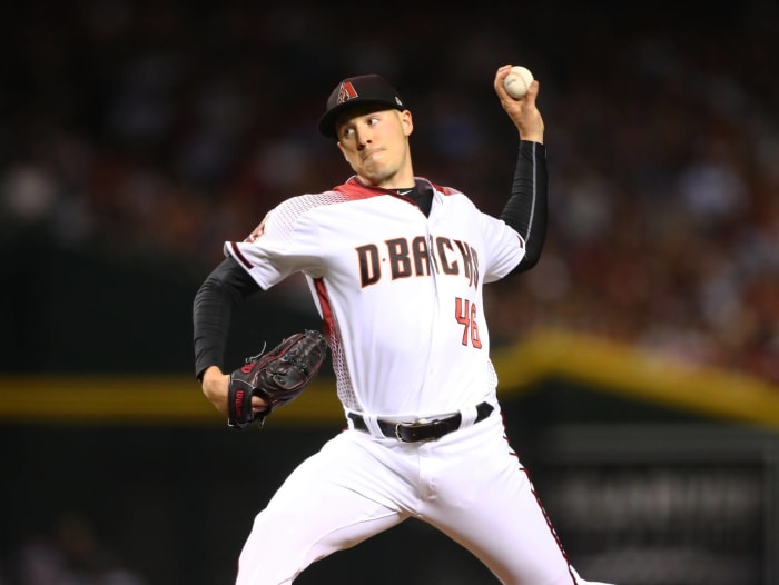
The Diamondbacks made some improvements from the initial uniform product that took the field. Unfortunately, Arizona probably would have benefited more from going all the way back to the drawing board — or going back to the unique color scheme of purple and teal. Instead, the D-backs came up with a uniform that is sorely out of place in today's baseball uniform world.
Orlando Ramirez / USA TODAY Sports
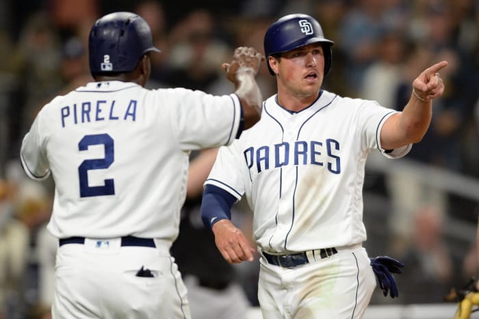
This photo represents the internal battle that the Padres are having with their identity. The brown and gold look is a color scheme that the fans badly want back, but the boring navy blue and white scheme that is uninspired and devoid of any unique quality is still around. It will be a great day for baseball when the Padres go back to brown, but until then, they're mired in the cellar when it comes to uniform looks.
Joe Camporeale / USA Today Sports
The Rockies are the only team in baseball right now that has a sleeveless uniform in the non-throwback rotation. This is a case where being unique is actually a bad thing. This uniform is not a good look at all, and other than their purple alternates, the Rockies don't have a uniform set that really catches your eye or makes you want to look at them for very long. They're just there, and that's never a good thing.
Jasen Vinlove / USA Today Sports
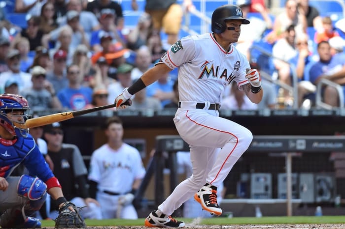
When the Marlins initially unveiled their completely overhauled visual identity a few years ago, one of the more eye-catching elements was the shade of orange that they used for their alternate hats and jerseys. Fast-forward to 2018 and now the Marlins are no longer wearing the bright orange hats or jerseys, which means that the Marlins have turned into yet another team that wears black hats with black lettering and numbers on the jersey. They've fallen into the crowd instead of standing out.
Kim Klement / USA Today Sports
While the Rays don't necessarily have bad uniforms, they once again suffer from being bland and blending in with the rest of the baseball crowd. Their light blue alternates are a nice change of pace, but other than that, they fall into the trend of being another team with navy blue as the main color when the Rays have had opportunities to go in a different and more unique direction.
Kevin Jairaj / USA Today Sports
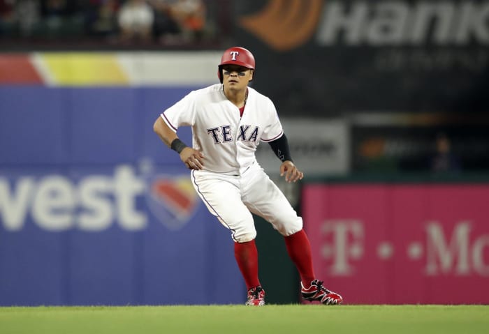
Like the Padres battling between brown and gold and navy blue, the Rangers are battling whether or not they want to be a red team or a blue team. Sometimes you see the Rangers wearing blue hats and socks, then the next day you'll see them wearing red hats and socks — and they do this with the same white uniform. It would be nice to see the Rangers pick one color and go with it. If that happens, they'd rise up in these rankings.
Jeff Hanisch / USA Today Sports
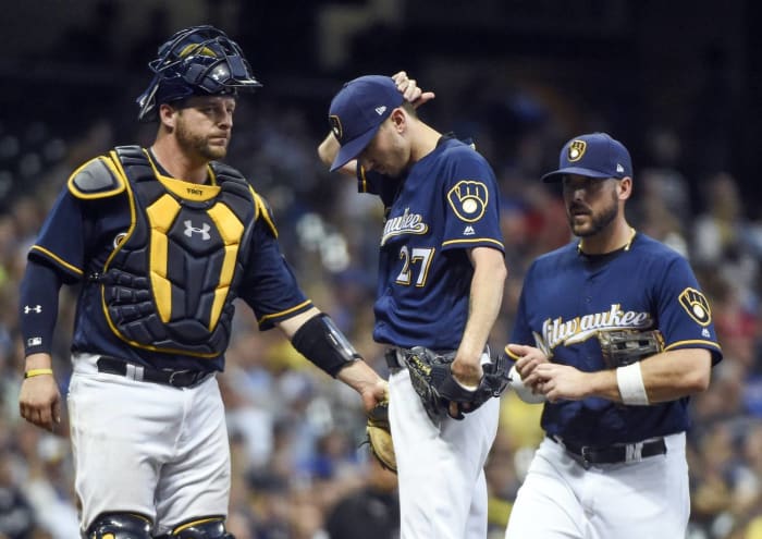
Do you see that glorious logo adorning Milwaukee's hats and sleeves? Unfortunately, the Brewers haven't figured out that all they need to do is make that logo their primary one. The ball-in-glove logo is timeless, and it looks great in the current color scheme. Once the Brewers decide to center their identity around the classic logo, they will be on the right path.
Evan Habeeb / USA Today Sports
The Twins have a very solid set of away uniforms. The uniforms in the picture are solid, and the navy blue version of this jersey is nice as well. The bad news is that their home jersey is weighed down by an unnecessary touch of gold, and it really brings down the entire uniform rotation.
22: Cleveland Indians
Ken Blaze / USA Today Sports
For those of you who have been waiting for Chief Wahoo to go away, you're going to get your wish once this season is finished. With that being said, it'll be interesting to see where Cleveland goes without having that logo adorning its unis. For the time being, the team suffers from wearing these navy alternates far too much. Maybe that will change once the new era without Chief Wahoo rolls around.
Brett Davis / USA Today Sports
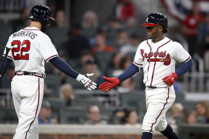
If we were going by home uniforms only, then the Braves would be in the top tier of this list. Instead, we have to consider their entire uniform set, and that's where the Braves falter. The classic navy blue hats with red brims are nowhere to be found on the road uniforms, and the iconic look of the divisional dynasty Braves has been diluted by a glut of unnecessary alternate uniforms.
Kirby Lee / USA TODAY Sports
Just like the Braves, the Giants have a top-tier home uniform but a bottom-tier look when they leave their home ballpark. They ruined their primary road uniform by adding piping to the jersey and also added the unnecessary road alternate that you see here. The Giants and Braves are prime examples of why you should always follow the theory of, "If it ain't broke, don't fix it."
Thomas Shea / USA Today Sports
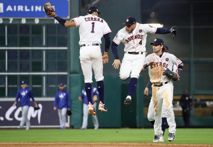
The Houston Astros have a solid look; their only real misstep comes in the form of their strange navy blue alternate uniforms that are loosely inspired by their infamous "Tequila Sunrise" uniforms. With that being said, Houston's uniforms are safe but still slightly interesting thanks to their embrace of orange. There isn't much to write home about here, but their look isn't bad at all.
Joe Nicholson / USA Today Sports
Amazingly, one of the first teams to adopt teal during the wacky logo and uniform days of the 1990s has stuck with it and been successful for the most part. The Mariners have made small tweaks to their uniform every now and then, but their core identity has stood the test of time. They even found a way to mash up the old colors with their current look, and it still worked. It should also tell you that baseball uniforms are in a good state right now when this is only the 18th best uniform set in baseball.
John Geliebter / USA Today Sports
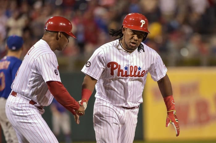
There are no frills with the Phils. They've stuck with this look since the early 1990s, and it's served them well over time. Better uniforms have been unveiled over the years, but the Phillies haven't felt the need to change from their look. Why should they? It's a solid look and one that still gets the job done after all of this time.
Jay Biggerstaff / USA Today Sports
The Royals are another team with a look that isn't going to be the most beautiful thing that you see, but it's still a good look. The royal blue is the star of the show here, and you can't go wrong with that classic KC hat as well. Again, it's more of a testament of how good the rest of the uniforms are that this one is currently ranked 16th in my eyes.
David Kohl / USA Today Sports
The Reds are still reaping the benefits of a an excellent identity refresh ahead of the 2007 season that saw them leave the dark ages of mostly black uniforms so they could once again embrace red uniforms. There are still traces of black, as it's unfortunately prominent as a brim color on the away uniform's hats, but they're used as an accent instead of a focal point, which is a good thing.
Brad Mills / USA Today Sports
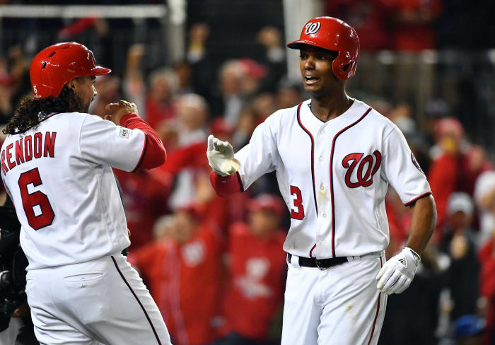
You can make all of the Walgreens jokes that you want, but there's no denying that the Nationals have some pretty good uniforms. The number font on the back is especially nice, and that's what helps it stand out from other uniforms. Plus, if there's ever a team that should be decked out in red, white and blue, it's the team that plays within walking distance of Capitol Hill.
Charles LeClaire / USA Today Sports
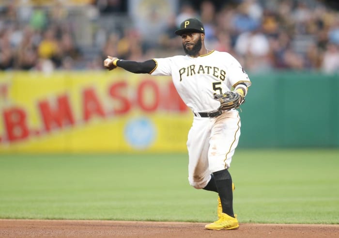
Speaking of unique number fonts that work well, the Pittsburgh Pirates are a prime example of that. Their number font fits the swashbuckling theme of a team that's nicknamed as the Pirates, and the team has a great set of uniforms. What's holding Pittsburgh back is the fact that the team tends to wear uniforms that throw out the amazing color scheme in favor of camouflage. It's always nice to support the troops, but the execution of the concept is not the best, which brings down the rest of the look for the Pirates.
Evan Habeeb / USA Today Sports
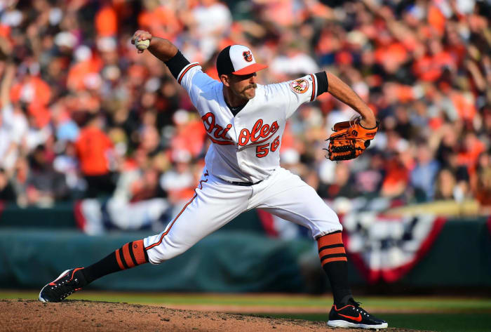
When it comes to hats, the Baltimore Orioles' home caps are top-tier. Seeing the classic cartoon bird on a white panel makes sure that the focus is on that lovely logo, and it also serves as a reminder that retro elements like this type of hat design can still have a place in modern baseball uniform design. The uniforms below the neck aren't too exciting, but that hat is absolutely amazing and has basically carried the Orioles to this lofty position.
Rick Osentoski / USA Today Sports
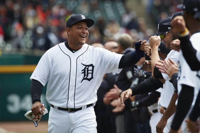
The Tigers have basically worn the same home uniform for the vast majority of their long history, but this year they made a small but important tweak to that classic uniform. The Old English "D" logo on the jersey now matches the "D" on the hat! As a result, the Tigers have moved into the era of standardization and are better off for it.
Jayne Kamin-Oncea / USA Today Sports
The Angels may have messed around with their official name a few times, but ever since they went to their current identity, they've stuck with it. That's for good reason — this is an absolute winner of a look, and there are no weak links in their uniform set. Their home uniform works, their away uniform perfectly complements the home uniform and their alternate red uniform is more of the same. The script works, the number font is great and the look is just a great one for the Angels.
Richard Mackson / USA Today Sports
Meanwhile on the blue side of Los Angeles, the Dodgers have a uniform set that has truly stood the test of time. All you have to do is replace "LA" with "B" and the Dodgers will basically be wearing the same uniforms that the team wore when Jackie Robinson was blazing trails in Brooklyn. Plus, the away uniforms have caught up with the home uniforms in recent years, and as a result, the Dodgers have a solid uniform set from top to bottom.
Wendell Cruz / USA Today Sports
The Mets may be one of baseball's infamously hard-luck teams, but in recent times they have looked very good while going through their unlucky moments. Like the Reds, the Mets greatly benefited from putting black on the sidelines — only New York actually completely eliminated black. They're a strictly blue and orange team, and it's a look that is superbly done and works very well for the Mets.
Winslow Townson / USA Today Sports
If we're being honest, all the Red Sox had to do to get things right was to simply wear red socks. However, the Red Sox have also gotten things right by not changing much. Their home uniform has remained basically untouched for decades, and their away uniform does the trick as well. Even their alternate uniforms do a good job of not straying from their original identity and fit in seamlessly with the team's classic home and away set.
Dennis Wierzbicki / USA Today Sports
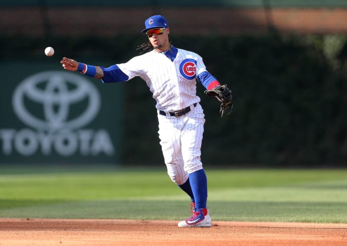
The Cubs are no longer lovable losers with excellent uniforms — they're now big-time winners who have great uniforms to boot. Their home, road and alternate uniforms are all very good, and the best part is that they all share a great shade of blue. Combine that with the lovely shade of red that accentuates the entire look and you have the recipe for a classic set of uniforms that have done the Cubs well over the years.
Jeff Curry / USA Today Sports
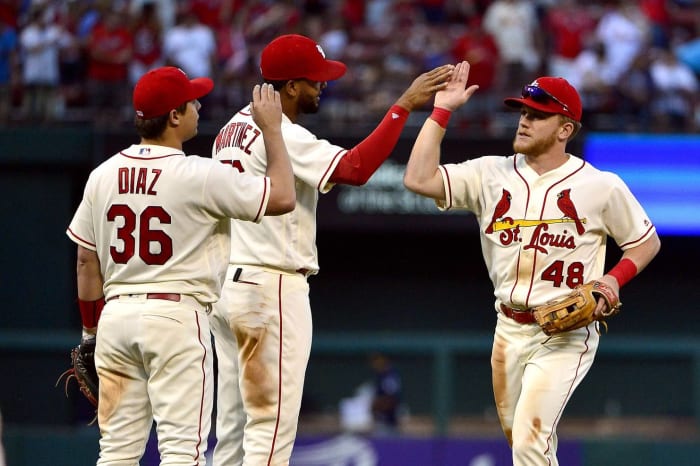
You are looking at one of the better alternate uniforms to ever grace a baseball field. The St. Louis Cardinals already had a great look with their home and away uniforms, but the team felt the need to join the parade of clubs with alternate uniforms. Let's just say that they nailed it, and it's part of the reason why the Cardinals are ranked so highly here.
Amy Kontras / USA Today Sports
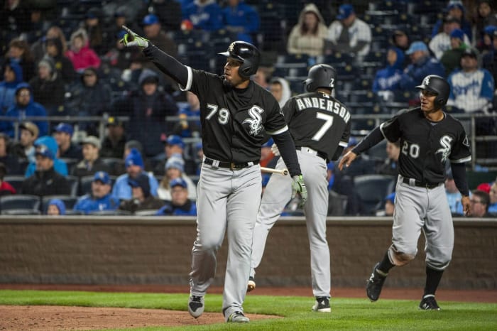
One of the best decisions that the Chicago White Sox made as a franchise was deciding to bring in the 1990s with the black and white look. This look brought much-needed stability to a club whose tradition was to switch up uniforms every few years. Now, could you imagine seeing the White Sox wearing anything other than their classic black and white color scheme? No, you can't. The White Sox hit the jackpot with this look, and it should be a mainstay for a long, long time.
Kevin Sousa / USA Today Sports
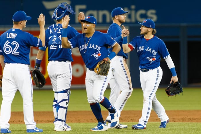
Another team that hit the jackpot when going back to a traditional look was the Toronto Blue Jays. Their look from their days of winning the World Series on back-to-back occasions was beloved by fans. Not only did they update that look — they improved upon it as well. From the hat to the pants, this is an elite look from top to bottom.
Robert Deutsch / USA Today Sports
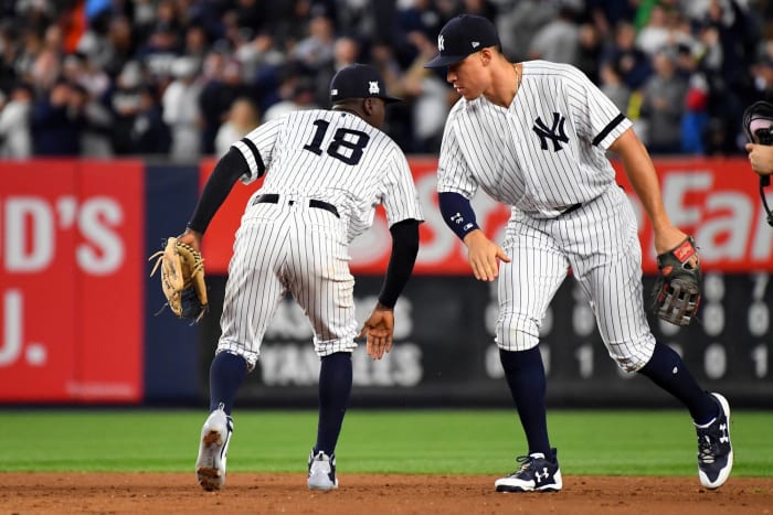
They've had this look for decades now, and they haven't felt the need to add any alternate uniforms or other bells and whistles because there's no reason to mess with perfection. The New York Yankees have stuck with a winning uniform set throughout their long history of doing a lot of winning. You will never see the Yankees change things up with their uniforms, and that is one of the only assurances that we have in life.
Kelley L Cox / USA Today Sports
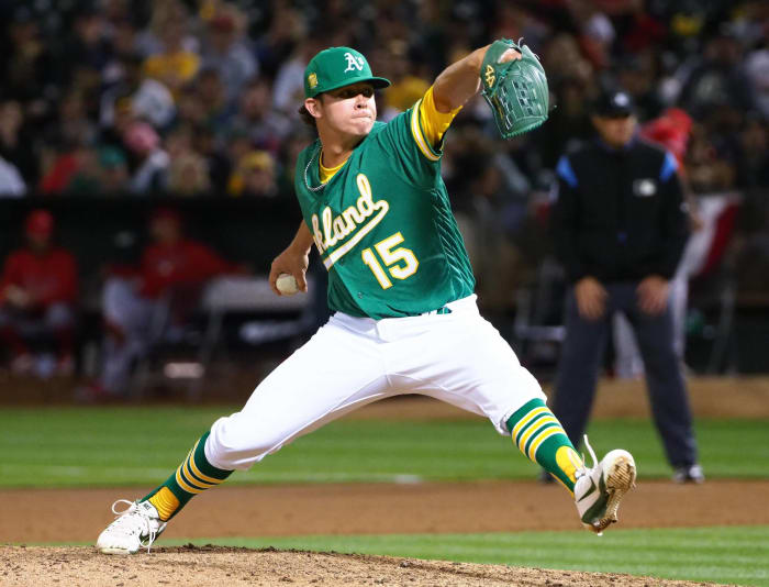
The Oakland A's already had a great set of uniforms to begin with. Their home uniforms are excellent, their away uniforms are great, their green alternates are lovely and their golden alternates are unique in baseball. Then they went above and beyond and decided to unveil a uniform that went back to the great days of Kelly green and gold, and that put them on top of the baseball uniform mountain. Oakland has five aces in its uniform rotation, and there's no beating that.


 +
+